Building a poker template
This is the first article in a series of niche templates I'm building. You can have a look at the finished template before we start if you want.
About the niche#
Today's topic is Poker sites. Poker, and card games overall, are hot these days and they are all over news. There are TV commercials for big international gambling sites even here in Sweden. Being in that kind of spotlight and receiving massive traffic must make those sites better than the rest, don't you think? Let's google for "poker" and have a look at the top 10 results (23 Jan 2006).
| # | Site name | Doctype | Validation errors | Layout method |
|---|---|---|---|---|
| 1 | Pokerroom.com | Transitional | 22 errors | Tables |
| 2 | Poker.com | Strict | 62 errors | CSS |
| 3 | Pokerstars.com | None | 48 errors | Tables |
| 4 | Pokerpages.com | None | 336 errors | Tables |
| 5 | Pagat.com Poker | None | 52 errors* | None |
| 6 | Worldpokertour.com | Transitional | 56 errors | Tables |
| 7 | Pacificpoker.com | None | 72 errors | Tables |
| 8 | Partypoker.com | Transitional | 22 errors* | CSS |
| 9 | Paradisepoker.com | Transitional | 1 error | CSS |
| 10 | Homepoker.com | Broken | 146 errors | Tables |
*) These sites required that we set a character set manually to even see how many errors there were.
What do we see up there? Poker.com and Paradisepoker.com do pretty well. Poker.com uses Strict doctype which means that their validation is stricter than the others, but 62 errors is still too much. Paradisepoker.com almost validates as Transitional which is a good thing compared to the other sites in the list.
Three sites use CSS for their layouts instead of tables. This is a good thing and they should be commended for it. However, that does not mean that they can't be better. All three with CSS layouts overuse divisions and spans terribly, often making the page a mess without CSS turned on.
Does this guy do nothing more than whine? I hear you ask. Yes I do. What I will do is nothing special; any one of you reading this could have done it yourself. I'm going to build a simple HTML document mimicking the front page of a poker site. If you are planning to build a site like that (or even if you are the developer of one of the sites above), you should definitely keep reading. The idea with all of this is to make it easier for people to follow the standards.
I will only include the front page of the site but it won't be hard to transform it to something simpler later on. Remember the purpose here: to show that it's possible to combine logical markup, valid code and make it look just the way you want it to. We need some kind of content though, so let's start with that.
Plan what features you want#
The features for the template will be my picks of the top10 above. Let's put some time on analyzing what features a decent poker site has.
The purpose of most of the sites seems to be to get people to play on their site. Most have some kind of client that is easily available from the front page and that button is the most important part of the page. Aside from that we need features to build a community around the game. Let's pick a forum as our community builder. Beginners need to have somewhere to learn the basics and everyone might need support from experienced staff sometimes. To build a good community you might also need news of some kind, displaying the largest prizes might give the site more players. Finally, all respectable sites have some info about the company behind it and if the site is big, they have a search. We want to earn some money too so let's add in a little advertisement. Sum this up in a list with descriptions.
- Play poker button: One big button telling people to click it.
- Beginners guide and support: Show on the front page that you don't need to be a pro to play and provide a quote from a professional player that illustrates this. Link directly into the guide to show experienced users that there might be something there for them too. Add frequently asked questions to this part too. Give users somewhere to turn to if they have problems.
- News: Front page should link to a couple of top news and at the bottom have link to a dedicated news-page with more info.
- Forum: Users should feel that this is a site with lots of people. Link to the topics in the forum most posted in to show them just that. This site is live and kicking.
- Search: Search might be important both if you look for either a poker term or for a feature on the site. Add search for both the forums and the news here and let people decide which of them to search.
- About us: Trust is important if you want people to part from their money. Put a picture of the staff online and quote reviews and happy customers (Don't fake this stuff. Never)
- Advertisement (Ads): Ads need needs to be marked up as what they are. We want users to click on the ads only if they like the service the advertisers are serving
We now need to transform this to HTML somehow. When you do this yourself, try to think as little about the color, fonts and such as possible. Focus on what content you want to show your users and build the HTML based on that.
On the next page we will get down to business and start coding. You want to see what I'm talking about don't you?
Time has come to go through the list of features and write the code for them. The question which we should keep in mind here is "What content do I have?".
Play poker button#
Ok. We want a poker button. Some people prefer to use
<input type="submit" /> for all kinds of buttons. Those buttons are made for submitting a form though, and that's not what we want here. When you think of it, is this "Play button" any different from a link? I think not. We will make it look like a button with CSS later on. Let's use the HTML of a simple link:
<a href="play-poker.html">Play poker</a>
Advertisement#
All sites cost money to run and getting that money is often done with some kind of advertisement on the site. What kind of ads should we use for this template? Looking at the top10 it seems that images are more common than text so let's use images. Don't forget to let advertisers specify alternate text to their images so you don't have to make something up for the alt attribute.
<h2>Advertisement</h2>
<a href="url_to_advertisers_site.com">
   <img src="/files/post-media/play-roulette-online.png" alt="Advertisement: Play roulette online" />
</a>
Beginners guide#
To get beginners to play on our site we need to at least teach them the basics. How? People don't like manuals and they are often hard to navigate in. The best would be if no manual were needed at all, but let's be realistic, some people will still need help. A good approach is to use questions in natural language to lure people to read the guide. Keep it simple and easy to read. To mark that this is the beginners guide we add a header with that name in. Don't be tempted to use any other header than h2, the h1 will be used for the name of the site and this is a second level header, nothing else. To mark up the questions we use a paragraph of text with links. At the end we add a link to more information. The class "more" there is just a way to say that this paragraph is different from the one above.
<h2>Beginners guide</h2>
If you are a poker beginner you might want to start by reading
<a href="help/rules-of-poker.html">the rules</a>. When you are done with that
you can <a href="#help/register.html">register an account</a> with us. Don't worry,
to join is free of charge and you can even win some money in our
<a href="help/monthly-tournaments.html">monthly tournaments</a>.
More questions are answered in the
<a href="help/frequently-asked-questions.html">frequently asked questions</a> section
News#
People playing poker are probably interested in poker news too. By having news on your site your users don't have to go somewhere else looking for them. This will be a separate section so we should add a header here too, h2 is appropriate. The news items themselves are just items in an unordered list, so let's use the HTML for that, <ul>. End it all with a link to the news page that we wrap it in a classed paragraph like before.
<h2>News</h2>
<ul>
<li>23 feb: <a href="news/highest-prize-ever">Highest Prize Ever paid...</a></li>
<li>5 jan: <a href="news/caught-cheating">Top player caught cheating</a></li>
<li>10 dec: <a href="news/how-to-improve">How to improve your betting</a></li>
<li>1 nov: <a href="news/pokercompany-featured">PokerCompany featured on...</a></li>
<li>30 okt: <a href="news/murkus-baltomi">Murkus Baltomi the new...</a></li>
<li>24 apr: <a href="news/planned-downtime">Planned downtime on Sunday</a></li>
</ul>
We maintain an <a href="#news/">news archive</a> too.
Forum#
The forum posts can be handled much like the news. A header, a simple list, this time ordered by with the most active on top. End it with a now familiar classed paragraph.
<h2>Forum</h2>
<ul>
<li><a href="forum/forum.php?topic=7">Best strategy with one...</a> - 124 repl.</li>
<li><a href="forum/forum.php?topic=572">Anyone know of a store...?</a> - 115 repl.</li>
<li><a href="forum/forum.php?topic=17">What's the name of the...</a> - 89 repl.</li>
<li><a href="forum/forum.php?topic=67">What your biggest pot?</a> - 51 repl.</li>
<li><a href="forum/forum.php?topic=23">There was this guy in...</a> - 49 repl.</li>
<li><a href="forum/forum.php?topic=325">Help me get my...</a> - 36 repl.</li>
</ul>
<a href="#forum/">Our forums</a> are always filled with people to answer your questions.
Search#
The bigger the site gets the more important it becomes to get a site search. A search clearly resembles a form; the user fills in a few values and sends them to the site. A simple textbox for the search query with a submit following it.
Just in case you're not familiar with the modern way to make a good form I'll go through the elements used below briefly.
A <fieldset> groups similar form elements together. For example, if you have two separate fields for first name and last name, you can signal that they are both part of the full name by adding a fieldset around both of them.
Using <legend> we then tell what the meaning of the fieldset is. For the previous example we could use "Full name".
The last "new" tag here is the <label>. It simply shows that there are a relation between the text in front of the button and the input box right next to it. A good thing about this relation is that it enables you to click on the label and have the input selected; something that is particularly useful with small radio buttons. This is what the HTML looks like:
<form action="search.php" method="get">
<fieldset>
  <legend>Site search</legend>
  <label for="phrase">Search: </label>
  <input type="text" id="phrase">
  <input type="submit" value="search">
</fieldset>
</form>
About us#
Everyone wants to know who they're dealing with before they make a purchase of some kind (I believe that's one of the reasons some e-shops have problems, but that's a completely different story). Anyways, it's easy for you to put up an image and some quotes from people that are happy with your services, so do it. The header and "more" paragraph should be familiar by now.
<h2>About us</h2>
PokerCompany has been in the business since 1997 and is...
Want to read <a href="about/">more about us</a>?
On the next page we will take all the pieces of HTML and put them together. It's getting interesting, don't you think?
What a structured document looks like#
We have carefully constructed all the markup for the important parts of the site. Notice that we've said nothing about the look of it yet, we’re strictly dealing with content.
We will first add all a good doctype (strict), character encoding and the other things needed for validation. I will not go over this again, it was described a couple of weeks ago in the beginner's guide. This is just copy and paste, so don't skip this part.
Aside from that we also need to add some "hooks", namely classes and ids, to make it easier to style the document (If you don't know what those two are I recommend you read through the beginners guide before continuing). Good class and id names have something in common: they describe the content. So using "tinyredbar" is a bad name and using "latestnews" is a good one.
The basics, the bits of HTML we constructed above and the hooks, together form a good logical structure to start with. When looking at that page you will notice that it doesn't look pretty. When you view the source of it you will see though - that's what I want to see when I look at the source of your front page. I get all warm when thinking about it; pure, logical, and accessible content. It's now time to position things where we want them.
Apply some fancy CSS#
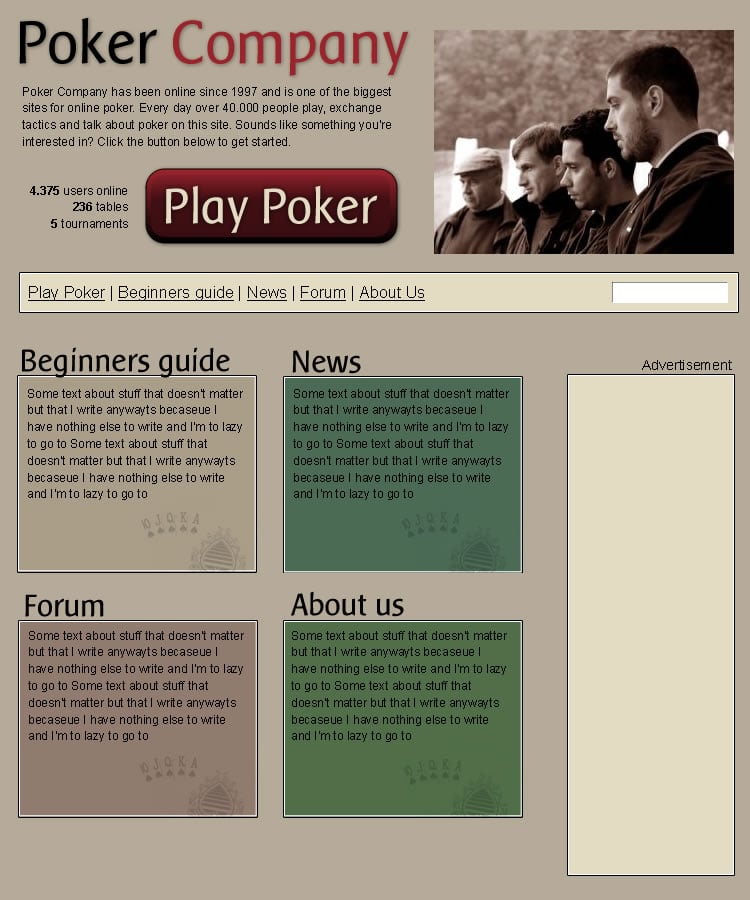
For me the design part always starts with an image program of some sort (Macromedia Fireworks lately for its ease of use). After a while of fiddling around with images and colors I decided to go for something like this draft (Note that I'm a programmer rather than a designer so don't expect wonders here :).
When you site there with your image in front of you and are on your way to start with the CSS there is one thing you should remember: do the positioning before you do the decoration. The positioning is the hard part and it will get even harder if you start to mix in colors and fonts. Let's all follow what I just said and start with the positioning.
Think of every tag you have on your page as a little box. By enabling borders on all your elements you can get a good idea of what I'm talking about. When deciding how to position these boxes it's always wise to start to look at "the flow" of the document. The flow is what you just saw when you looked at the structure above, content is just stacked on top of each other and most tags occupy the full width. By using some clever combinations of floats, clears and widths/heights it is possible to things to line up like we want.
Positioning the header#
Let's start by looking at the top. There seems to be four boxes here: a company name, company info, statistics, and the play button. The big image to the right can be added as a background, so we'll wait with that one. The first two boxes just need a smaller width to be where we want them (compare with how they where positioned in default flow). The last two ones need to be floated left and given a width (this will place them side by side).
#header h1 {
   height: 65px;
   width: 400px;
}
#header p {
   width: 400px;
}
#header ul {
   float: left;
   width: 130px;
}
#header a {
   display: block;
   height: 84px;
   width: 261px;
}
Positioning the navigation#
Next up we will deal with the navigation and search. Start by adding clear: both to the navigation to make sure we are below any floats from earlier in the code. To make the navigation list horizontal we add display: inline; to all list items. We complete the navigation by setting a width on the list and floating it left.
The search box is a bit harder. All that info won't fit in the tiny space we have left so my idea is that we hide the fieldset, legend and label. "Why go through the fuzz of adding them and then hiding?", I hear you shout. Relax. They're there because they help users that surf the site with CSS turned off, people like your rich grandmother (using Netscape 4), blind users (using screen readers) and Google. Visual users still know that the textbox is for searching because of the "Search" on the button afterwards, so we're not hiding important information. Ohh, and the header won't fit our design either so let's hide that too.
#navigation {
   clear: both;
   height: 41px;
   width: 720px;
}
#navigation ul {
   float: left;
   list-style: none;
   width: 400px;
}
#navigation li {
   display: inline;
}
#navigation form {
   float: right;
   width: 250px;
}
#navigation legend, #navigation label, #navigation h2 {
   position: absolute;
   left: -10000px;
   text-indent: -10000px;
   line-height: 0;
}
#navigation fieldset {
   border: none;
}
Positioning the advertisements#
Ahhh, ads, both hated and loved at the same time. Not to include ads on a big site like this would just look strange. Let's position it like we want. First move it down below the navigation by clearing. Then float it right to get it out of the way from the content below.
#adverts {
   clear: both;
   float: right;
}
Positioning the content#
This is going well; the content is next up for positioning. Note that I added a couple of divisions to this part of the HTML when merging. They will come to good use now as holders of the four sections. Each of the boxes is given a specific width and height and gets floated left.
#content div {
   float: left;
   height: 200px;
   width: 240px;
}
Phew, this feels like a whole days work doesn't it? On the last page of this tutorial we will put all positioning together and show an example of how everything looks when decorated. Click next below.
Putting it all together#
Now it's time to take all these small parts of CSS, put them in a CSS-file and apply it on the structure we had before positioned. Can you recognize the different parts from the previous page?
I could bore you to death by explaining every little margin in the decoration step but I won't. Instead I will just show you the prettied up version of the site. You can have a look at the second CSS file used if you want.
Let's have a look at the same properties we looked at in the beginning of this article:
| Site name | Doctype | Validation errors | Layout method |
|---|---|---|---|
| Friendlybit template | Strict | 0 errors | CSS |
Summary#
I hope this tutorial has showed you that CSS far from rocket science; could you not have done this yourself? The web really needs to be freshened up and made accessible for everyone, and with your help it can. Do your part by telling your friends, by holding a short presentation where you work, and by supporting webmaster you know work like this. Use your imagination, how can you make people understand?
Still here? Ok. If you're uncertain, ask yourself: can you afford to be left behind?
I hope this article gave you some insight to the development of a poker site. This article was the first is a series of articles about niche templates so be sure to check back for more. Any comments?