Finer details of floats
The other day I was working on one of those two column layouts. I quickly got into trouble by something I thought was a bug. It was a bug, but not in the browser(s) I thought. Let's go.
A two column layout I said, but this one was a bit different. Each column consisted of a number of boxes, much like a newspaper kind of layout. I wanted the boxes ordered a bit different though: Content editors on the site ordered articles by importance in a single list and when that was transferred to a two column layout I wanted the second most important article to the right of the first article rather than below it. In the HTML source the boxes were ordered like the editors wanted and my job was to make them display in two columns.

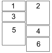
"This can't be that difficult" I thought and floated all odd numbered divs to the left and all even numbered divs to the right. Behold the huge gap on the left side. I was stumbled. IE displayed it like I thought it worked, Firefox and Opera both displayed the gap (note to self: it's seldom a bug if both Fx and Op display it the same).
So, where does the gap come from? I went looking in the CSS specification on float positioning and found an interesting list of the rules that govern floats. As with almost all specifications they are not meant to be easy to read, so made a version of them where I use some sample code to explain each of the rules.
This is the sample code you need to have in mind:
<div id="parent">
    <div id="child">...</div>
    <div id="child2">...</div>
</div>
#child { float: left; }
#child2 { float: left; }
- #child and #child2 must stay to the right of #parent's left border.
- #child2 must be to the right of #child since #child is earlier in the source. If there is not enough space to the right of #child, #child2 must be moved below #child instead.
- If #child2 was floated right and #child and #child2 could not be fitted on the same line, they still must not overlap.
- #child and #child2 must stay below #parent's top border.
- #child2's top border may not be higher than #child's top.
- If #child was display: inline; #child2 must still not be above it.
- With #child and #child2 both floated left on the same line, #child2 may not stick out outside of #parent's right edge, unless it is already as far to the left as possible.
- #child and #child2 must be placed as high as possible
- #child and #child2 must be placed as far to the left as possible.
The tricky one here is rule 5. It means that if #child was moved down for some reason, #child2 will have to move down too. Check the example again. See the space above box5 and compare it to the top of box4. Box5 can't be above box4 according to rule 5 above. This is clearly what's going on here. If we made box2 smaller than box1 there would be a space above it by the same reason.
Note that the list of rules is a prioritized list; rules earlier in the list are more important than the latter ones. To Internet Explorer, rule 8 seems to be more important than rule 5. Strange move by IE.
I hope this gave you an "Aha!" feeling, it certainly gave me.
Comments
By: Cerebral (#1)
By: Mark C. (#2)
Thanks for the tip
By: Rowan Lewis (#3)
But its too late to complain now :(
By: Skalman (#4)
I agree that it could be a problem, and I believe there isn't a solution, without JavaScript, or some kind of future conditional CSS.
By: Rowan Lewis (#5)
clear: *;had been set.This would let us choose how we want the design to work, because I can see that both options are useful.
By: Emil Stenström (#6)
It's not too bad in my opinion, putting the boxes in two "column divs" was easy enough (even though that gives another source order).
As long as browsers render things _one_ way, whether that way is good or bad, I'm all happy :)
By: Jennifer Grucza (#7)
By: Emil Stenström (#8)
By: exe (#9)
Shouldn't going over it once be enough? Something like this:
By: Emil Stenström (#10)
By: Adedeji Olowe (#11)
By: Emil Stenström (#12)
By: Engraellat de caixes - blog.esbudellat, esbudellant estàndards (#13)
By: gotMilk (#14)
'#child2 must be moved below #child2 instead' should read '#child2 must be moved below #child instead', no? ;)
By: Emil Stenström (#15)