Suggestions for TweetDeck
To be an effective twitter user you really need a permanent window on your desktop, that shows you what's happening right now. I've been using TweetDeck for a long time now, with short detours into Seesmic and various smaller clients. TweetDeck is the best client I've found for my needs, but its interface has lots of little bugs and inconsistencies; small things that together add up to a bad user experience.
I hope someone from TweetDeck reads this, and can start working on these (simple) issues. I really think they would improve the general user experience a lot.
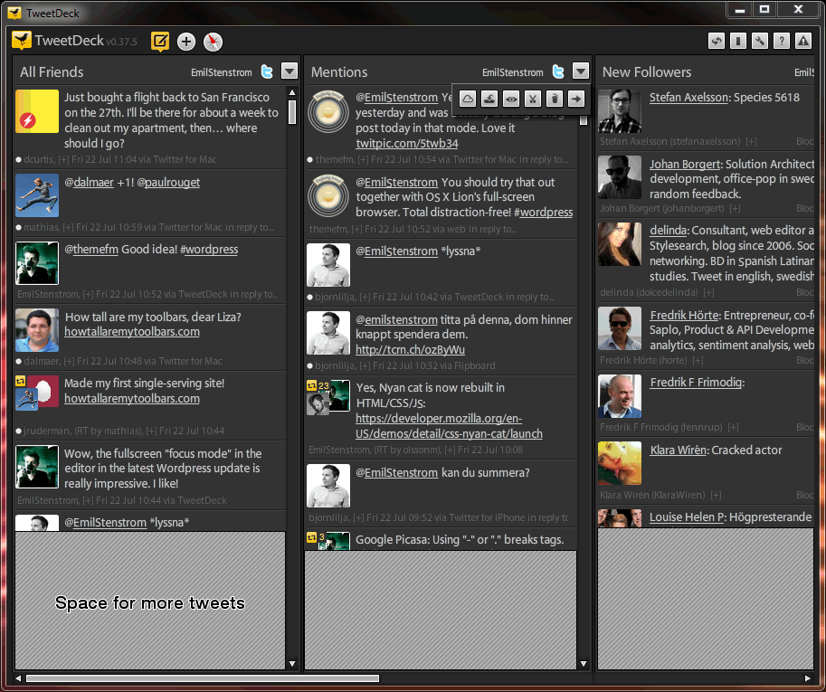
- Compose pane should close after a tweet as been sent. I've looked over the shoulder of lots of people using TweetDeck, and the most common pattern is to click the reply button on someone's avatar to write a new message. If writing multiple messages directly after eachother was more common than writing them one by one, then it should stay open, but that's not the case.
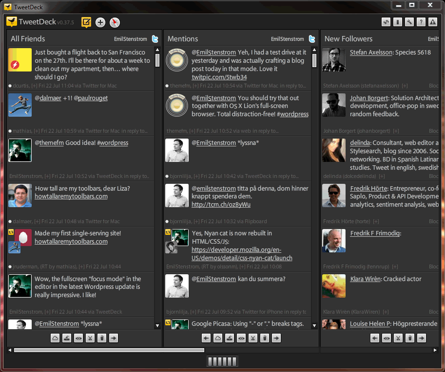
- Tweets should be as compact height-wise as they can be. All tweets in TweetDeck are displayed as if they where full 140 chars. This means that valuable screen space is lost, something TweetDeck pushes one of its advantages over the official Twitter client or the web. "More Tweets per screen!". What's worse, having tweets aligned horizontally over several columns makes it look like there's some connection between then. Why do they align my third timeline tweet with my third mention? No idea.
- All retweets should be shown, not only the last one. Retweets are a very important part of Twitter. By seeing who retweets you, you learn who your active followers are, and maybe even find people that are interesting for you to follow. But TweetDeck does not follow the lead of the official client that shows "Retweeted by [user] and 3 others", instead they show just the last one.
- The buttons at the bottom of each column should be hidden. The bottom buttons of each column are for things that people rarely use, but they still are allowed to permanently take of screen estate. Instead they should be hidden behind one button, and put at the top of the window with the column title. This would leave even more space for tweets to be shown.
- The "Quick jump to column" buttons at the bottom of the window should be removed. Having clickable icons that set the scroll offset is a very strange interface concept. I understand the need to jump between columns when you have 10-15 columns, but most people don't have that. Letting an interface element that is used seldom by most people take up that much space is just a waste. It users with that many columns is an important part of the target audience, use tabbed workspaces instead. Each workspace could show up as a tab at the top of the window, and each workspace could have its own set of columns. Until that's done, remove the clunky icons at the bottom and free more space for tweets.
Here's a quick sketch of how TweetDeck looks before any changes:
… and here's the same view *after* the five interface improvements have been implemented:
These are changes I really would like to see in TweetDeck, what do you think?


Comments
By: Johan Forngren (#1)
By: Emil Stenström (#2)
By: Jonathan Thomas (#3)
Google+ support would be my 2 pence!
Also, in my Android app I can have a stream (in one column) of Twitter and Facebook posts, how do I emulate this in one single column on the desktop version?
By: Emil Stenström (#4)
By: Jonathan Thomas (#5)
By: Peter Reuterås (#6)
By: Emil Stenström (#7)
By: Djaii (#8)
By: Emil Stenström (#9)
By: Jamie Murphy (#10)
By: Sandy S. (#11)
http://news.softpedia.com/news/Google-Unveils-First-Details-About-Its-Upcoming-Google-Platform-for-Developers-216559.shtml